
If you’ve played around with investment websites at all, and ever looked up mutual funds at all, you’ve no doubt noticed a little 3×3 square.
For example, on the Vanguard page for its Total Stock Market Index Fund, you see this:

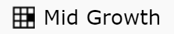
Meanwhile, the Vanguard Growth Index Fund shows this:

And the Vanguard Small-Cap Index Fund shows this:

It’s not just Vanguard too. Go to Morningstar and look up a random mutual fund and you’ll see the same square in a different form:
So what is this mysterious square and what does it mean for you?
The square revealed
The square is called a “style box”, an easy and visual short hand way to categorize mutual funds. It was originally created by Morningstar, but companies who employ it have put their own spin on it, and now it’s universally used.
The mutual fund style box has two axes, one for market capitalization (basically size of companies) and one for aggressiveness (or volatility). The market cap axis is divided into “small”, “medium”, and “large”, while that style is divided into “value”, “blend”, and “growth” (which are euphemisms for “not very aggressive”, “kind of aggressive”, and “super aggressive”).
With three options on each axis, one is able to divide most mutual funds into one of nine categories.
Mutual funds meet astrology
In this respect, the style box is not all that dissimilar from the astrological method of dividing people up by their sun sign, or the Meyers-Briggs method of personality types (that’s the “INFJ” thing). Not everyone with the same sun sign has the same personality, and ditto the personality type, but they are designed to give you a general sense of the person (assuming you believe in any of it).
In all cases, you will find uniqueness if you look closer. For mutual funds, the best bet to get those details is to read the prospectuses.
Good for diversification?
The style box can help with diversification. If all the mutual funds you own are large-cap / growth (as an example), you could be missing out on the movements of smaller-cap companies, and also your portfolio might be more volatile than your personal risk tolerance can handle.
But I would caution against too much focus on “collecting the whole set”. In fact, the way some people talk, they see the square as a collection of nine check boxes. (“I’ll make sure I have equal amounts of all nine squares, so I’ll be properly diversified.“)
Now, remembering that all of these categories are generalizations, I don’t think it makes sense to have equal weights of “value”, “blend”, and “growth”. I’ve seen lots of mutual fund returns, and I think that too much “value” (low aggressiveness / volatility) won’t yield the returns we need in order to have enough for a comfortable retirement. (Read more about my take on this in the post titled How to know when it’s time to get conservative about investing for retirement.)
I feel less concerned about the small/medium/large cap diversification, as that seems like more personal choice. I don’t think one needs to be overly concerned about dividing up evenly between the three categories, but I would caution again going after only the big (or small) companies.
Summary
The style box, while a useful shortcut, is only a general guide in helping you understand what type of product a particular mutual fund is invested in. Like a horoscope, it can’t get very specific, but when a general categorization is needed, it is a helpful tool.
Just don’t feel like you need to collect the whole set.
But enough about me. How do you use the style box?