I use the “chart of the century” to show that not everything has gone up in price, outpacing inflation, just the important things.
Every once in a while an infographic or other chart comes along and basically sums up everything in a very profound way.
Take this comic from XKCD, which shows how theory and experiment match up so well as to be incontrovertible.
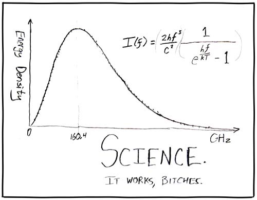
(If you’re curious, this graph shows blackbody radiation, theory versus experiment.)
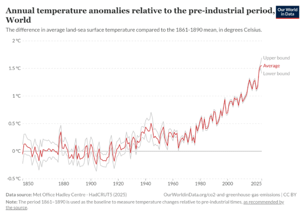
Or how about this chart showing global temperatures relative to the pre-industrial period. Hard to not see a human connection here.
Which brings me to another chart, one that shows a lot yet tells a singular story, namely: what has gotten more expensive and what has gotten less expensive, relative to inflation, over the past 25 years.
You may feel like everything has gotten more expensive, but that’s actually not true. But it’s the differential between what’s gone up and what’s gone down that says volumes.
Let’s take a look.
Table of Contents
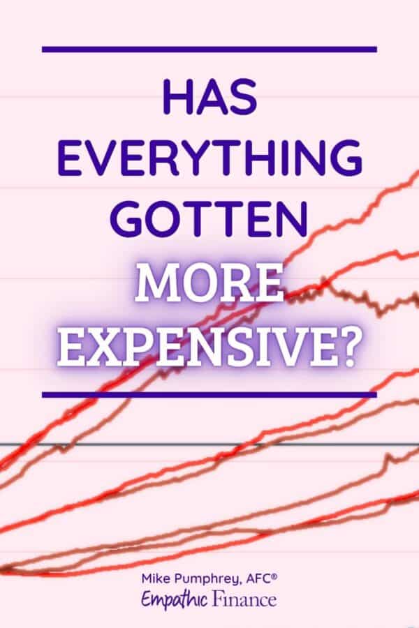
Chart of the Century
The chart, which has been updated since at least 2018, has been termed the “chart of the century” due to its seismic effect on all who interpret it.
It was created by Mark Perry, an economics professor and blogger, using data from the Bureau of Labor Statistics.
Enough talk, let’s view this thing of beauty.
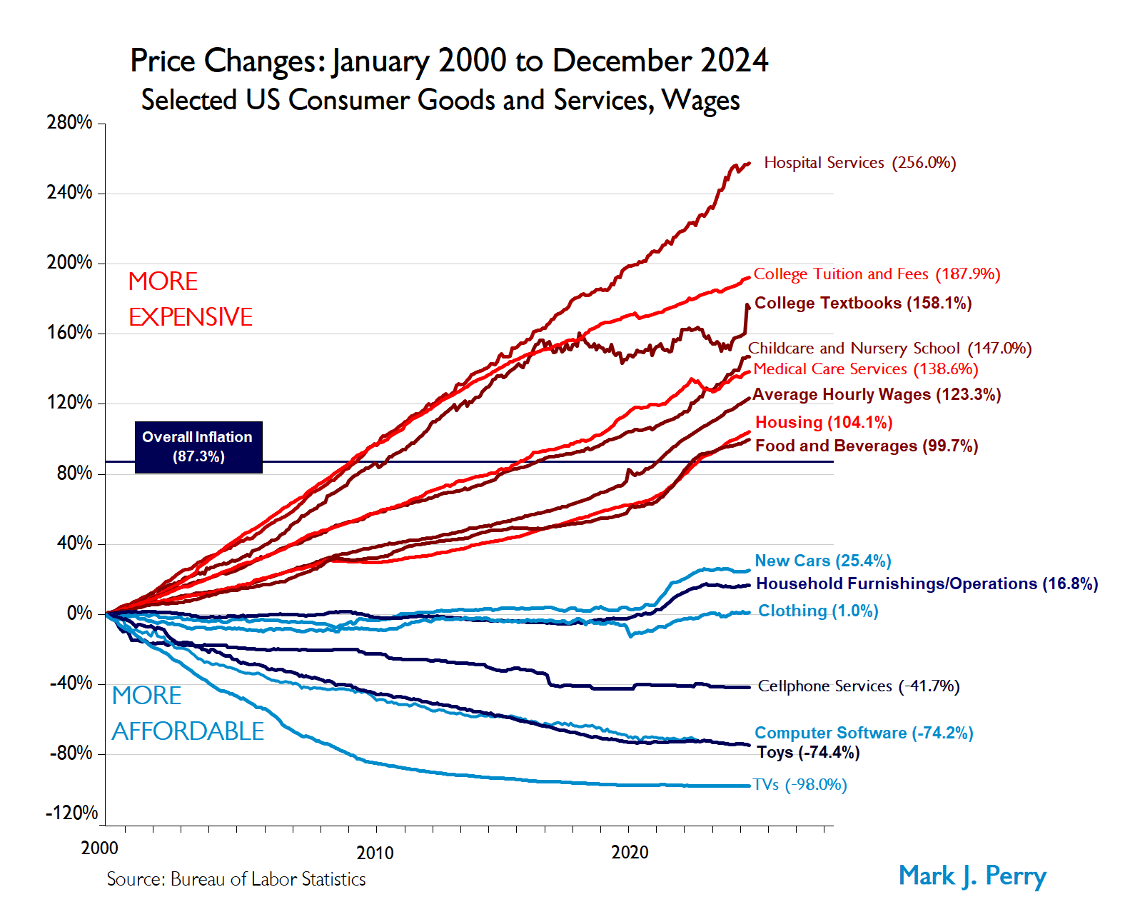
Stare at this for a while, as there’s a lot to unpack. (And click to enlarge.)
Unpacking the chart
Fundamentally, the chart shows certain consumer goods and services as a function of time as a percentage of the price the item was in the year 2000. So everything starts from the same point.
But from that point, literally everything diverges. The red lines have outpaced inflation, while the blue lines have run behind inflation, and in some cases actually gotten less expensive.
The baseline here is “Overall inflation”, which during this timeframe is 87.3%. For reference, that translates into an average inflation rate of 2.5% per year.
Anything that’s greater than 87.3% over this time period will be outpacing inflation, and anything that’s less is running below inflation.
And remember: outpacing inflation means “feels more expensive”, relative to other things.
What’s gotten more expensive?
Hospital services tops the chart at an eye-watering 256%, running at three times the inflation rate. That’s followed by college tuition and textbooks, and then childcare, “only” twice the inflation rate.
Average hourly wages are outpacing inflation by a bit, which is nice. That appeared to happen during the pandemic years according to the chart.
Similarly, housing and food have also jumped up and price since the pandemic, which definitely makes some sense with people’s lived experience, though it’s interesting to see that these price rises are not that significant here.
What’s gotten less expensive?
TVs! I love this line item. TVs, according to this chart, have basically become free, more or less. 98% less expensive? That’s crazy.
That’s followed by toys, software, and cell phone services, all of which have gotten less expensive, not just more affordable relative to inflation.
New cars were holding steady until the pandemic, and now are 25% more expensive, but still not outpacing inflation.
What can we make of this chart?
There is a lot you can pull from this chart in terms of conclusions.
But I think the most on-the-nose response to this that I can think of was courtesy of the How Money Works YouTube channel. (Quote comes at 8:42.)
“The things that we wanted became cheaper, but the things that we needed fell out of reach.”
I couldn’t possibly better that response.
In 2000, you could buy a 36″ TV for $1,000 ($1,880 in today’s money) and today, if you even find anything that small, it’ll be less than a tenth of that price.

But if you need to go to the hospital, pay for college, or get any medical care services, good luck with that, because it’s all wildly more expensive.
Data doesn’t lie
I thought this chart was fascinating, and the more I look at it, the more I learn from it.
Like any backward-looking macroeconomic data, it’s not clear if there’s anything actionable that regular people like us can do with it. Or if there is, maybe you can let me know.
But it’s a great snapshot of where we are in time.
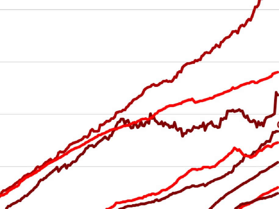
Here’s a version of the chart from 2018. It’s interesting to see how different it is (especially as this one doesn’t have the pandemic in it).
It’ll be interesting to see what becomes of these figures going forward, especially if we’re heading toward a period of stagflation.